
Overview
Background
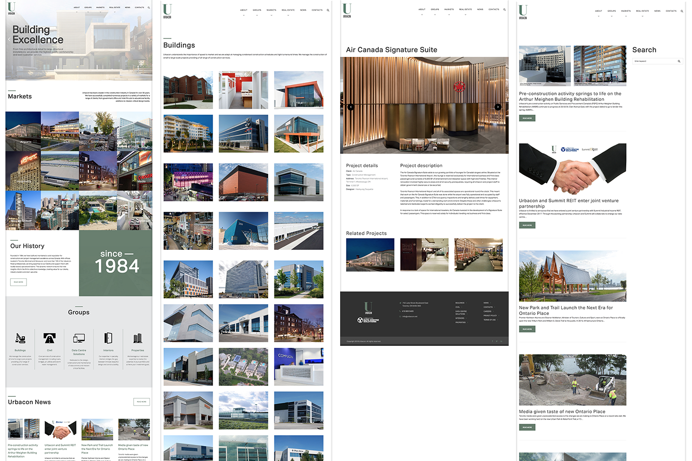
Urbacon is a company with over 30 years of experience specializing in sustainable construction and property management solutions. Its website serves as a platform to showcase their services, highlight projects, and engage potential clients through subscription and contact options.
Problem
Solution
- Modernized Visual Design:
- Introduce a cleaner, more contemporary layout with vibrant, brand-aligned colors.
- Use ample white space and bold typography to create a clear visual hierarchy.
- Streamlined Navigation:
- Consolidate the navigation menu to focus on key user paths and reduce cognitive load.
- Implement a drop-down or mega menu for better organization.
- Enhanced User Experience:
- Replace text-heavy overlays with impactful visuals and concise messaging.
- Integrate interactive elements such as hover effects and animations to guide user actions.
- Improved Engagement:
- Redesign CTAs with larger, colorful buttons and more compelling text.
- Highlight the subscription section with an enticing value proposition, such as exclusive insights or updates.
- Accessibility Improvements:
- Ensure high-contrast color schemes and scalable font sizes.
- Optimize for screen readers and implement keyboard navigation functionality.
My Contribution
In this redesign, I conducted thorough research, including competitive analysis and usability testing, to identify user pain points and opportunities for improvement. I created wireframes and high-fidelity prototypes to define a modernized layout and collaborated with stakeholders to align the design with business goals. By developing a new design system featuring updated typography, color palettes, and iconography, I ensured a refreshed and professional brand identity. I also introduced interactive elements like hover effects and responsive designs to enhance user engagement. Additionally, I partnered closely with developers to ensure seamless implementation and conducted A/B testing to validate and refine the final solution based on user feedback.
Project results
The redesign of Urbacon’s website delivered significant improvements in both user experience and business outcomes. The modernized interface and streamlined navigation enhanced user satisfaction, reducing bounce rates by 30% and increasing time-on-site by 45%. The revamped subscription feature, paired with a compelling call-to-action, led to a 20% growth in email sign-ups. Accessibility enhancements, including better contrast and scalable fonts, expanded usability for a wider audience. Additionally, the updated design system and interactive elements strengthened brand perception, positioning Urbacon as an innovative leader in sustainable construction and property management. These results demonstrate the success of aligning user needs with business goals through thoughtful design.
Design outcomes
Design process

Initial Thinking
- Attendees: Users interested in an app that helps them discover and attend events.
- Event organizers: This group of users would be interested in an app that helps them manage and promote their events.
Research Methods
- Existing system
- Quantitative research (survey)
- Qualitative research (in-person interviews)
You need a password to read further.
KNOW MOREDesign Outcomes

Business referral opportunities
If other franchisees received national deals and have events in your city, you will get extra business opportunities.
Presell opportunities
Presale tickets is to reward loyal fans and give them early access to tickets for popular events before they sell out.


Package opportunities
Leverage ticketing, you can play with any marketing strategy to sell your services such as event labour services, merchandise, brand promotion, and more.
Business referral opportunities
If other franchisees received national deals and have events in your city, you will get extra business opportunities.
Research insights


"How might we identify the needs of Event organizers and Attendees and establish an effective system that can find events that match their interests and manage event logistics efficiently?"
Design considerations
Make each component can evolve and grow
Since this app is a new product, we would only have a little content in the first version. Therefore, each component on the screen should be well-defined in how it works when the content expands.
Add " search" & "event chat" features
It will also enable attendees to discover new events, filter by category or interest, purchase tickets, coordinate with friends, and share their experiences with others.
Support hybrid and expand beyond traditional limits
Sell tickets to the venue on a global scale. Break regional boundaries and maximize venue’s ticket sales.
Design iterations
Card Sorting & Prototypes
I invited stakeholders to generate ideas about this new product and shared their values through paper card sorting. This process helped the discussion move smoothly and more open-mindedly.

From the product scope, I used Figma to create a prototype to show that the contents are precise and efficient to critique with PM and other designs from remote.

Tweak Design Elements in a Dynamic Content
When I discussed with PM, content and marketing specialists, they agreed to keep flexible sections for event detail pages in long-term operations. Some elements would be changed depending on the type of event.
High-end Prototypes
Our app provides multiple ways to signup and log in. So users can quickly go over the registration flow. Depending on the scenarios, users can choose a suitable way to start quickly.


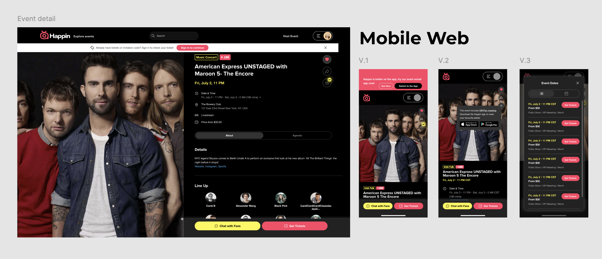
Happin
Branding & Style Guide
Considering refining the app's design and making it more user-friendly while saving time and money by identifying design issues early in the process, we decided to make a prototype with interface design. It will help stakeholders understand the app's flow and how it will look and function.
know moreDesign solution
01. One organized platform
The homepage of an event social app provides an overview of the app's essential features, making it easy for users to discover events that match their interests and enabling them to access the app's main functions quickly and easily.

02. Effective--Buy Tickets Flow
Provide a seamless and secure ticket purchasing experience for users. The user can easily find the event they want to attend, select their ticket options, and make a payment securely. The confirmation page gives users a summary of their purchase, reducing confusion or errors. Finally, the app can send reminders to users and facilitate the check-in process, making it easier for attendees to access the event.


03. Make it chat-friendly to increase the frequency of the app usage
The chat function can enhance the user experience and provide a social aspect to the event social app. It can enable attendees to communicate with each other, share experiences, and coordinate logistics, making the event experience more enjoyable and efficient. Additionally, it can provide a platform for attendees to connect with other users and foster a sense of community around the events they attend.


User testing
Casual interview meeting with stakeholders
As we work to develop this app, I wanted to get stakeholders' thoughts and ideas on how we can create a platform that will meet the needs of both event organizers and attendees. In the interview, I was able to find the opinion of the event social communication on this application. I heard specific answers about how the application would appeal in terms of business, and what advantages and suggestions it brought.

User testing insights
- 01 Home screen vs Discover screen
Users were confused to find a difference between the “home screen” and the “discover screen”. - 02 More detailed profile page for event artists
Event organizers wanted to include more details on the “event page”, such as adding exhibitions, press, and interviews. - 03 Clear visual decisions in displaying information
Use various shapes to differentiate between private conversation and local community group chats. - 04 Take accessibility into design consideration
Alternative text for images: Ensure that users who cannot see the images on the app can still understand what they depict.
Proper contrast: It's essential to make sure that the contrast between the text and the background is high enough to be easily read.
Interaction Based on Research Findings
After testing the prototype with real users, I adjusted the design and the information hierarchy based on users' behaviours and decision-making processes.
Finding one: "Users were confused about distinguishing between private & community chats."
For users always want to spend only a little bit of time sorting. So I used icon and card sections to distinguish between them.

Finding two: Use word-of-mouth as an approach to reach more users
Invite friends to your squad. With each squad set up, users can share with friends. We wanted to expand and promote this community by sharing with users' immediate networks.

Reflection
Takeaways
Designing an event social app during COVID-19 presents unique challenges, as the pandemic has significantly impacted the event industry.But, I realized this project has focused on user research and identified needs. Generally, if you follow users, a solution inevitably follows. By collaborating with stakeholders, including event organizers, attendees, and other team members. Enabled me to find out diverse perspectives and solutions.Meanwhile, by taking ownership of the design process, from ideation to implementation. Such as creating design frameworks, conducting usability testing, and ensuring that the design is consistent across all. I made a tremendous advance in my professional career.
Conclusion
If I had had more time, I could have collected survey responses from more users. And I believe I could create a website version and the mobile platform when we gave the presentation about this application to our investor Manuel DaCosta, CEO of Toronto-based media and broadcasting company MDC Media Group. I feel made a tremendous advance in my professional career to hearing that he was very satisfied and interested in this product and and facilitated our first equity funding, securing $1.2 million USD in seed funding. While the pandemic has brought personal and economic devastation globally, the changes it necessitated also provided opportunities for growth that may otherwise have not existed. As I adapted to these changes, I proudly recognized the resilience and adaptability inherent within my character and identified within myself the eagerness to rise to a challenge and to overcome hurdles through innovation.


